Why the best new brand strategy for Straubing was not a new logo, but a shared history.
Sometimes the right way is not a new logo, but a plan to utilise your own strengths effectively: the area of influence, the city’s many institutions, the mission statement and its successes and the new campus in the city. EMBASSY developed a brand and marketing strategy for the city of Straubing that optimally utilises the existing potential by connecting all stakeholders through shared stories and a uniform image.
________
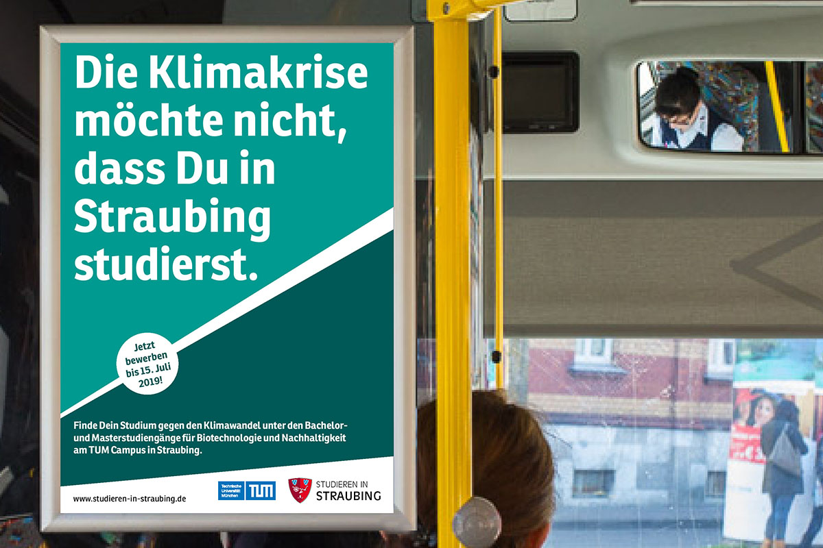
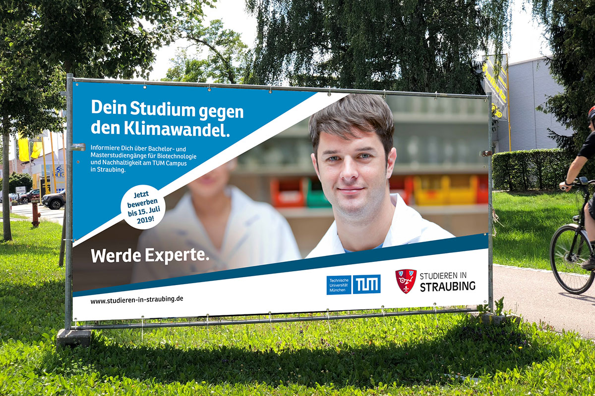
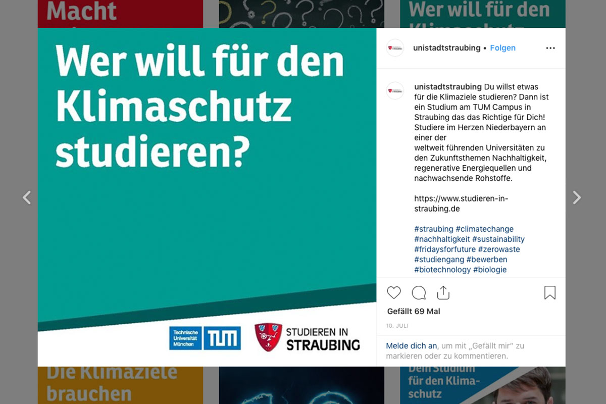
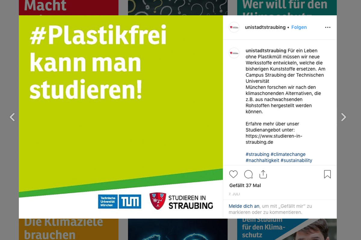
The city of Straubing becomes a university city and has been pursuing a plan for years to become more sustainable, but the realisation in the joint workshops was sobering: the progress, the results and the number of measures are hardly noticed.
The primary causes were the highly fragmented brand and the lack of a guiding principle in terms of content: many players in different forms, each acting on their own, and a strategy that the city had not yet translated into messages. Yet this is precisely where the greatest potential was discovered. With a population of just under 50,000, Straubing is a central area for 240,000 people, and every day Straubing can present its work and achievements to this audience.
The city’s logo was simply updated with the most important change: University City Straubing. The appearance was revised and modernised to be more usable for all channels and to signal the momentum in the city. In a process that involved many of the city’s stakeholders, the city’s various organisations that work for the citizens were united under the new image.
The result is a new image of Straubing. From rubbish bins to wayfinding systems, city marketing to the university location campaign, the city is demonstrating how Straubing is making itself fit for the future for the population and all those who want to become part of it.