How the city of Friedrichshafen found the right images and design principles to tell the brand and core messages.
The city of Friedrichshafen was in great need of modernising and unifying its design concept. EMBASSY guided the city in redesigning its brand architecture and developing a layout concept that modernised the brand of the Zeppelin’s hometown and visually unified the city’s numerous facilities and contributors.
________
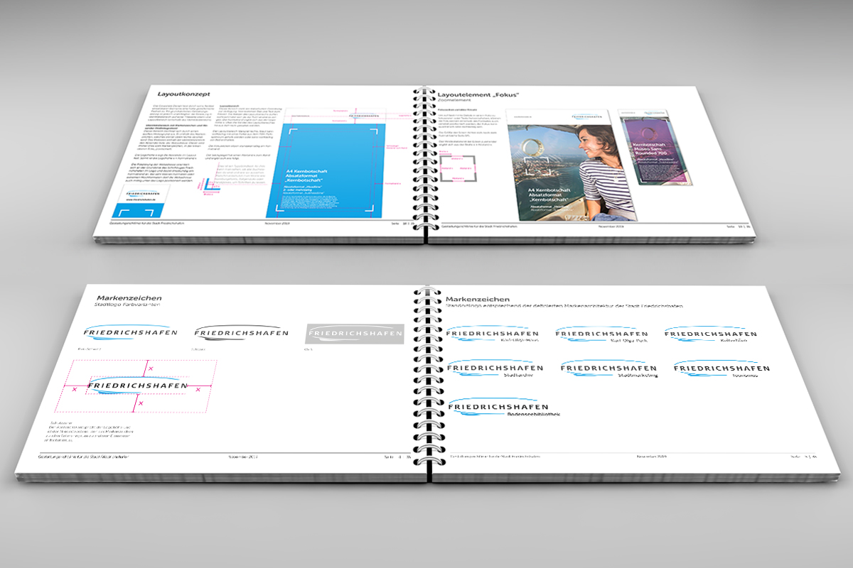
Friedrichshafen is the home of the zeppelin. So the iconic airship was supposed to remain in the logo, but after an extensive branding process, the city set itself a major task: the design of the city was in urgent need of updating and revamping. In particular, the city owned institutions needed to be much more connected to the city. EMBASSY developed a new corporate design for the Friedrichshafen destination brand in 2019. The existing trademark of the city of Friedrichshafen was expanded by EMBASSY – in addition to the umbrella brand, numerous sub-brands were created.
The brand architecture was expanded and a new layout concept was created to communicate the city’s core messages more clearly. This gives the city a fresh and modern appearance. The central element, the “focus”, draws the eye to the city’s core messages. To ensure that the new look runs through all parts of the city’s marketing, EMBASSY created design templates for different formats and programs. The new corporate design was applied to the entire business design and was laid down in a design guideline so that in future the city will be able to design independently.